Unlocking the Beauty of Elegant Color Palettes: A Comprehensive Guide
Unlocking the Beauty of Elegant Color Palettes: A Comprehensive Guide
When it comes to design, whether it’s for fashion, interior decor, or digital art, the right color palette can make all the difference. Elegant color palettes not only elevate the Aesthetics of a project but also evoke emotions and create memorable experiences. In this article, we will explore various aspects of elegant color palettes, offering insights and practical tips to help you make the right choice for your next project.
The Essence of Elegant Color Palettes
Color is a powerful tool in any designer's arsenal. An elegant color palette refers to a selection of colors that work together harmoniously to convey sophistication, refinement, and style. It often includes muted tones, soft shades, and complementary hues that are easy on the eyes. These palettes can enhance a space's ambiance, highlight key features, and even influence the mood of those who inhabit or engage with it.
Why Use Elegant Color Palettes?
There are several reasons to consider using elegant color palettes in your projects:
- Aesthetic Appeal: Elegant color palettes offer a pleasing and sophisticated look, elevating the design.
- Emotional Impact: Colors can trigger emotional responses; an elegant palette can promote calmness and comfort.
- Versatility: Elegant color palettes can fit a variety of design styles, from modern minimalist to classic vintage.
- Brand Identity: For businesses, a refined color palette can significantly enhance brand perception and recognition.
Choosing the Perfect Elegant Color Palette
Choosing the right color palette can be daunting, but it is essential for creating a cohesive design. Here are some tips to help you select an elegant color palette:
1. Understand Color Theory
Color theory is the foundation of any color selection process. Knowing how colors complement, contrast, and interact with one another will guide you in selecting the best palette. A basic understanding of the color wheel, including primary, secondary, and tertiary colors, is crucial.
2. Take Inspiration from Nature
Nature is one of the best places to draw inspiration from when creating an elegant color palette. Observe the soft hues of a sunset, the subtle variations in a flower garden, or the calming blues of the ocean. Incorporating these colors will evoke a sense of tranquility and beauty.
3. Utilize Online Tools
There are various online tools available that can help you generate and visualize color palettes. Websites like Adobe Color, Coolors, and Canva Palette Generator allow users to create and explore different combinations to find the most suitable palette for their project.
4. Test and Experiment
Once you have a few color palettes in mind, it’s essential to test them in your design. Start with small samples, or use digital mockups to see how the colors interact in different lighting and contexts. You may also wish to simulate the colors in actual materials (e.g., fabrics, paints, etc.) for a realistic effect.
Incorporating Elegant Color Palettes in Different Contexts
Now that you understand how to choose an elegant color palette, let’s dive into how to apply these palettes in various contexts:
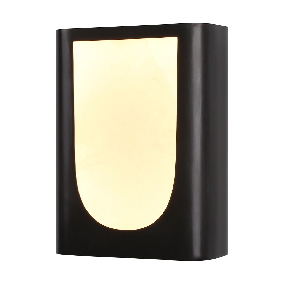
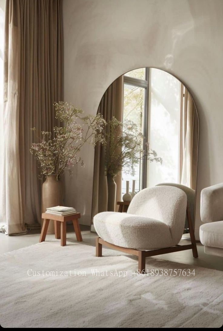
1. Interior Design
| Color Palette | Application |
| Pastel Blues and Whites | Bedroom - Create a serene sleeping environment. |
| Earthy Tones (Browns, Greens) | Living Room - Bring the comfort and warmth of nature inside. |
| Soft Grays and Golds | Bathroom - Exude luxury and elegance. |
2. Fashion
In the fashion industry, elegant color palettes often lead to timeless collections. Designers can create outfits using understated color combinations that cater to various occasions—from daytime elegance to evening sophistication. Consider muted pastels paired with more vibrant accents for a visually appealing ensemble.
3. Graphic and Web Design
In graphic design, the use of elegant color palettes can communicate professionalism and attract the target audience. Many websites adopt simple color schemes, predominantly featuring soft colors, to maintain a clean and appealing aesthetic. Additionally, applying these palettes in marketing materials can significantly enhance brand image.
Popular Elegant Color Palette Combinations
To get you started, here are some popular elegant color palette combinations:
| Palette Name | Colors |
| Classic Monochrome | Black, White, Gray |
| Muted Jewel Tones | Emerald Green, Ruby Red, Sapphire Blue |
| Soft Neutrals | Beige, Taupe, Soft White |
Conclusion and Recommendations
Incorporating elegant color palettes into your designs doesn’t have to be difficult. With an understanding of color theory, the right tools, and a willingness to experiment, you can create stunning visual experiences that reflect sophistication and style. Remember to take inspiration from nature and maintain a test-and-evaluate approach when selecting colors.
As you embark on your journey with elegant color palettes, keep in mind the emotional impact of colors and how they influence perceptions. Choose a palette that resonates with your intended audience, making thoughtful choices that align with your overall vision. Happy designing!